Case Study
EastLake Community Church
Eastlake Community Church is a vibrant, unified church body in the Smith Mountain Lake region of Virginia. They came to us requesting an updated logo and wayfinding signage for their new building that was wrapping up construction.
The Problem
Eastlake Community Church had a visual identity problem — its logo was dated and didn’t match the innovative ministries of the church. With an upcoming move into new facilities and all the wayfinding signage that would be needed, it was the time to bring their visual identity into alignment with their DNA.
When we began to work with them, EastLake was 5 months away from the completion of new facilities. In anticipation of an influx of new people attending, we knew that they also needed to clarify the key elements of their brand so new people could quickly grasp who they are and engage in their mission and core values without diluting the culture of unity and passion for evangelism.
How do you scale a healthy culture quickly?
A brand strategy equips the church to easily communicate who they are so new people can quickly embrace the culture and share it with others.
The Solution
In a half-day workshop, we gathered with their staff to refine how they talk about their mission, core values, and brand maxim (a concise statement that expresses who they are).
We defined the stages people normally go through in their engagement in the life and mission of the church, digging into their needs, desires, influences, and next steps to better communicate with people at different milestones.
Scope of Work
- Brand Strategy, Survey & Workshop
- Logo & Visual Identity System
- Brand Architecture & coordinated
- Key Messages, brand maxim
- Brand Guidelines
- Environmental Graphics: Wayfinding & Culture-building Signage
- Production Management
- Communication Design Consulting
- Wearables
- Website consulting & design (in process)
The Visual Identity
We presented two possibilities for the logo. The first was a more contemporary icon-based logo that pointed to EastLake’s proximity to the Smith Mountain Lake and conveyed hope through an implied sun, and flow, reflecting their mantra that “it’s not as important how many come as how many go.”
A second option updated the script of the original logo, making it more legible with rounder forms and cleaner lines.
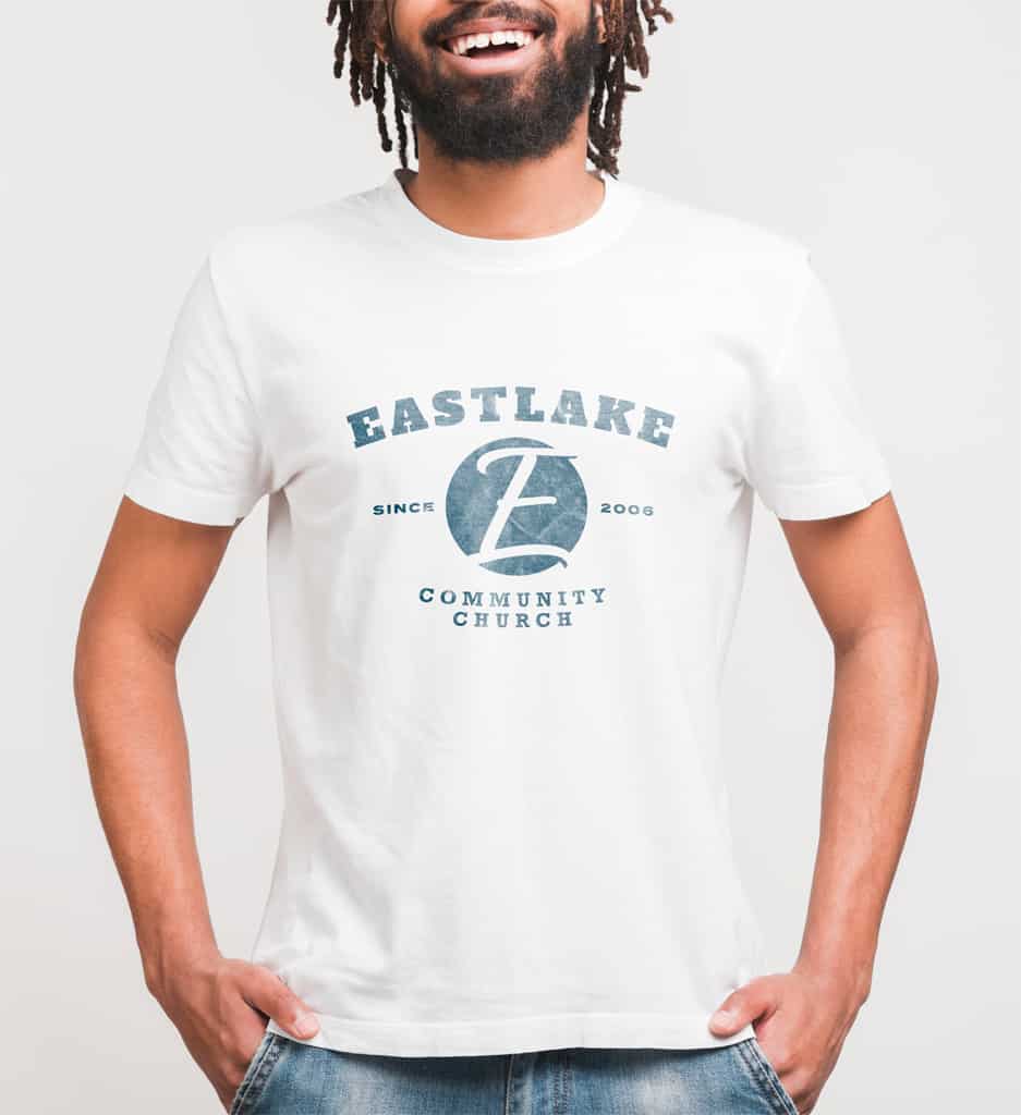
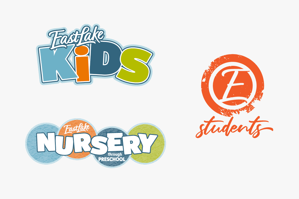
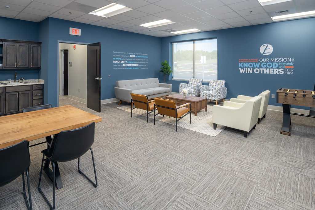
Because of an overwhelmingly positive reputation revealed in a survey, we ultimately decided to leverage the good emotions already associated with the familiarity of a script logo and we created an “E” icon as a supplemental graphic.
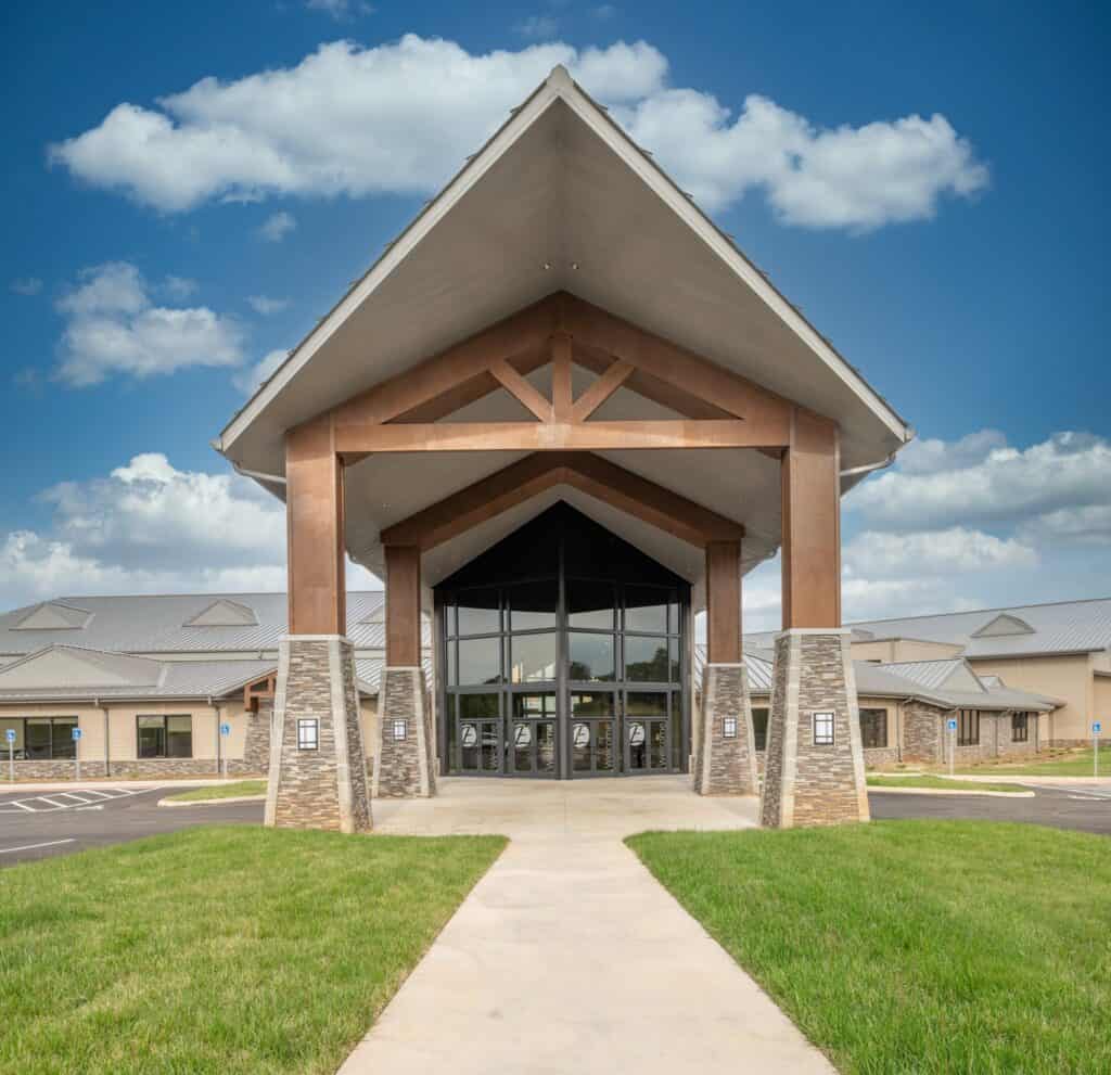
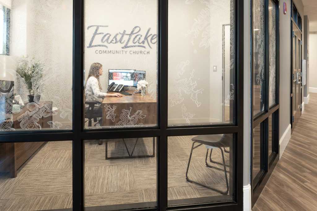
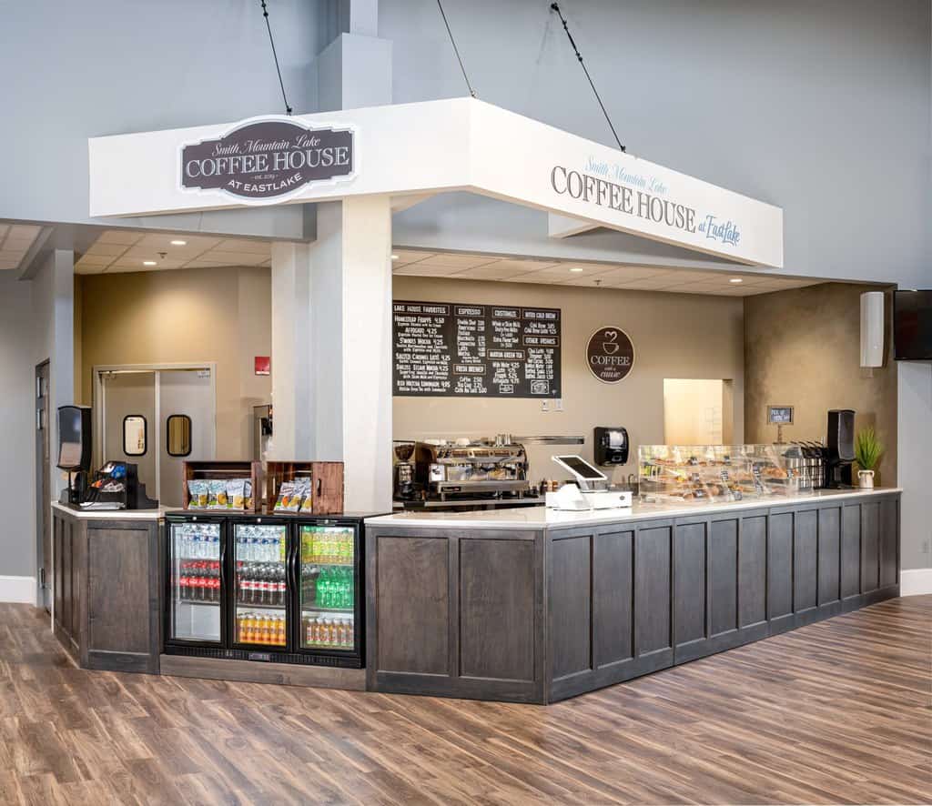
A repeated pattern in their identity system is a topographical map of the region featuring Smith Mountain Lake. It’s a reminder that the church is there for the community. When locals are in the building for a cultural event or a coffee from the Smith Mountain Lake Coffeehouse at EastLake, we want them to feel like they belong there.
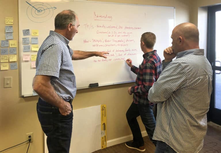
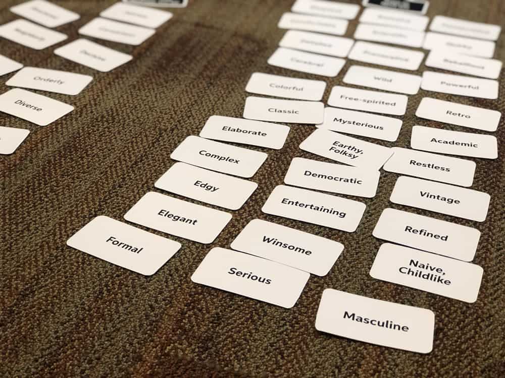
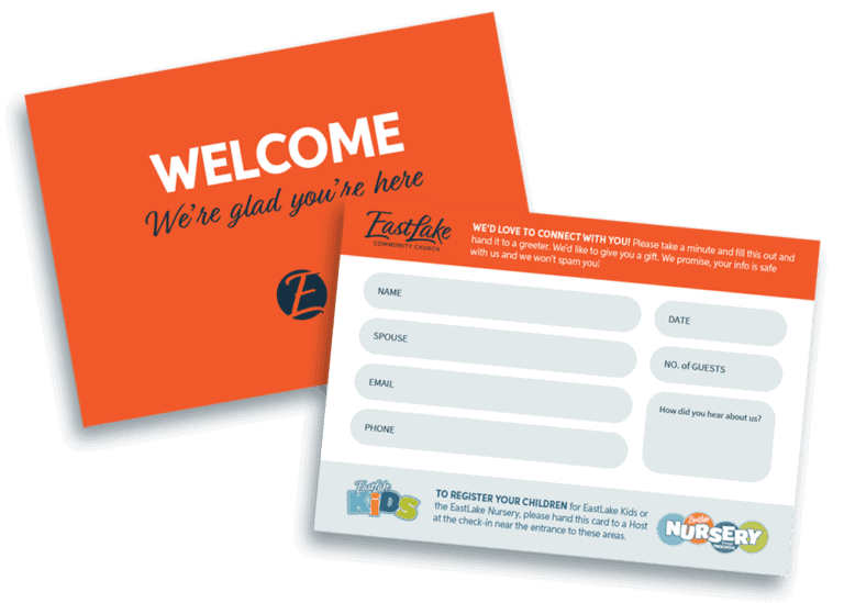
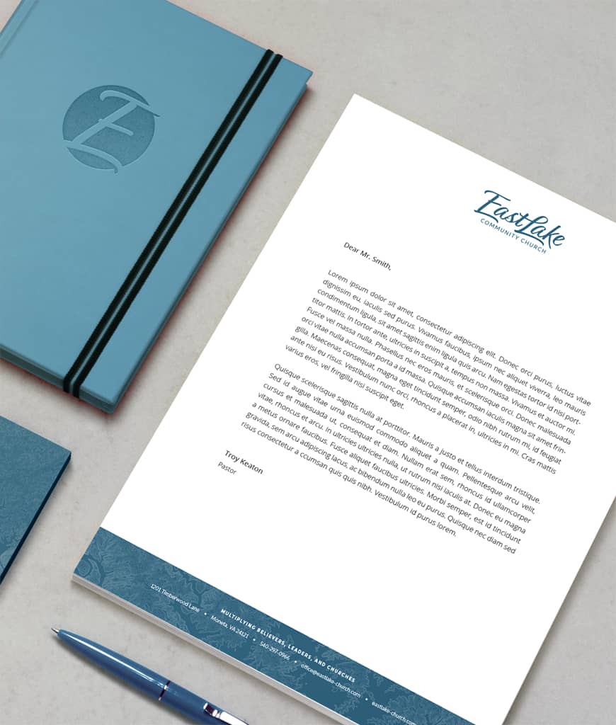
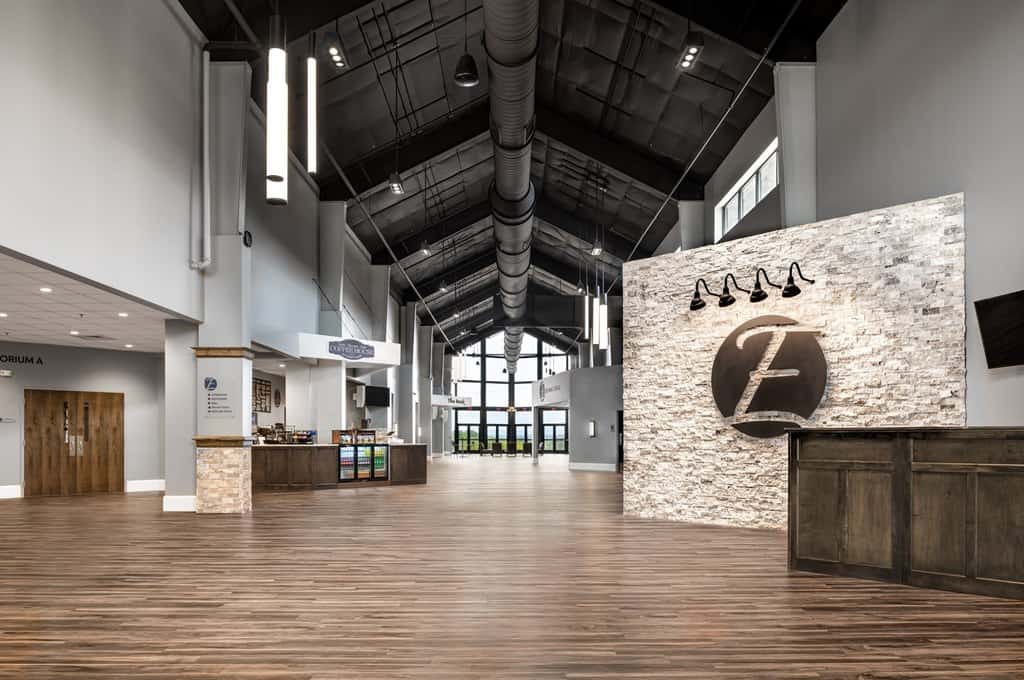
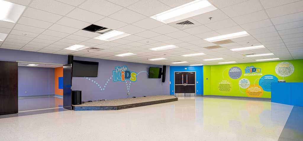
We established brand guidelines then created culture-building environmental graphics and wayfinding in the new facilities, along with wearables and printed communication pieces to help spread the culture.
Sometimes small tweaks make a huge difference
In the first two months of using the new Connect Cards to collect contact information from guests, EastLake collected Connect Cards that represent 83 households — that’s about a 300% increase. Two changes made a big difference: We make the card bright orange so it’s easy to spot and identify (i.e., “Grab the bright orange card, fill it out and drop it in the box by the door.”) Then we cut down on the number of items of personal information they were asking for on the cards.
