Case Study
Great Lakes Region
Five districts of The Wesleyan Church had voted to merge and explore how they could be better together: Wisconsin, Illinois, and three Michigan districts were becoming The Great Lakes Region (GLR). A new brand strategy was needed to guide messaging and communications in this newly formed region in order to create clarity and unity around their shared mission and values.
The Challenge
A survey of pastors from the district revealed that despite the affirmative vote to merge, the pastors were feeling a lot of fear that they would be lost in the larger region.
The largest district was the de facto leader in terms of number of churches and budget, and pastors from the smaller districts in particular were skeptical about the benefits of the merger for them.
Pastors of small and rural churches expressed fear that they would be marginalized as the Region focused on urban areas and church planting over their revitalization efforts.
How do you successfully merge cultures?
A brand strategy equips the church to easily communicate who they are so new people can quickly embrace the culture and share it with others.
The Solution
In a half-day workshop, we gathered with their staff to refine how they talk about their mission, core values, and brand maxim (a concise statement that expresses who they are).
We defined the stages people normally go through in their engagement in the life and mission of the church, digging into their needs, desires, influences, and next steps to better communicate with people at different milestones.
Scope of Work
- Brand Strategy, Survey & Workshop
- Logo & Visual Identity System
- Key Messages, brand maxim
- Brand Guidelines
- Production Management
- Website Design & Development
The Visual Identity
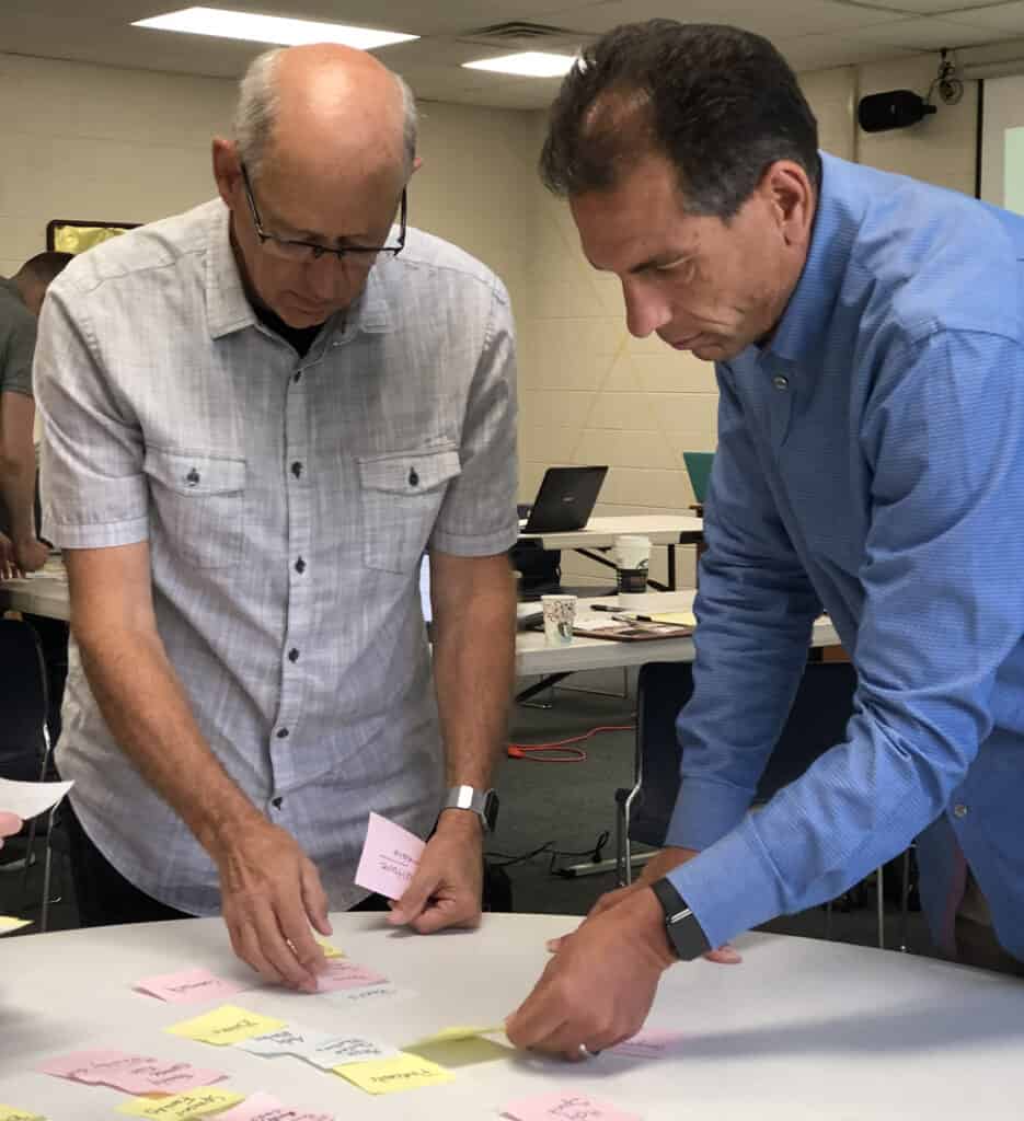
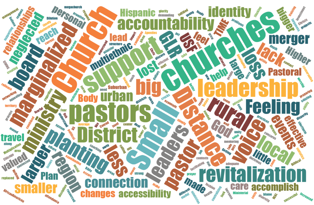
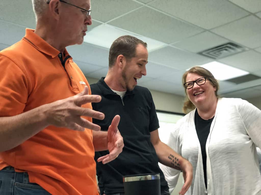
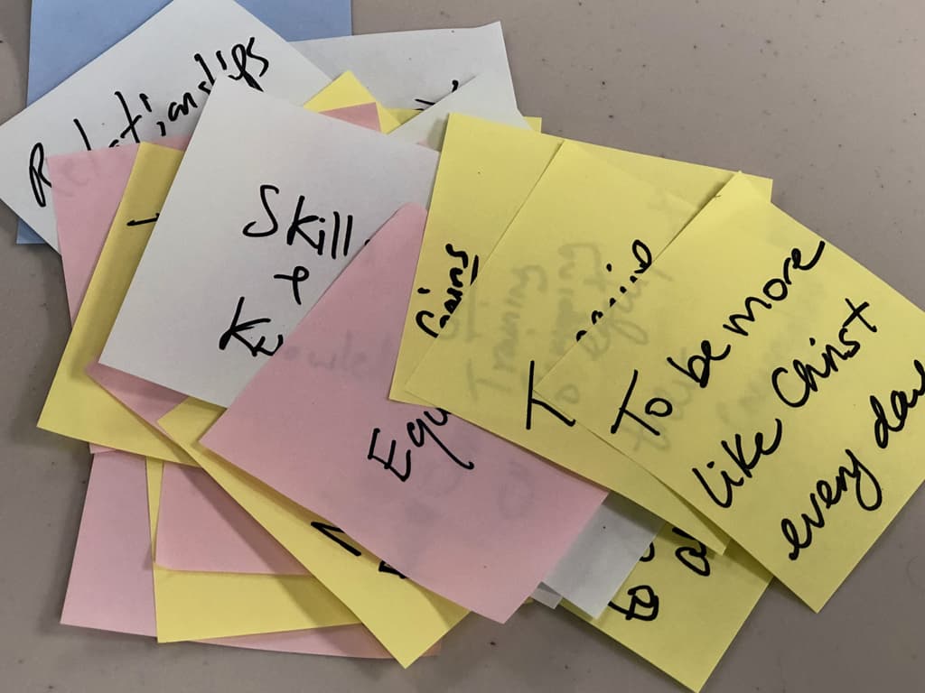
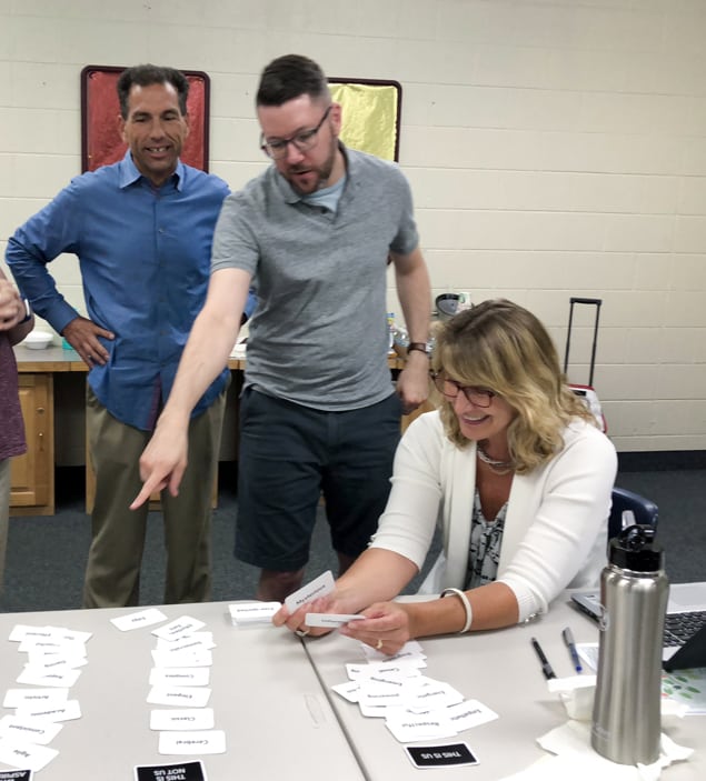
We brought together key leaders from each district, the former District Superintendents who were moving into new roles as Specialists, office staff, and two pastors from the region, for a one-day Brand & Culture Workshop. Our goal was to get everyone using the same language to talk about where they are headed as a region and develop consistent messaging that would help the pastors of the region feel supported.
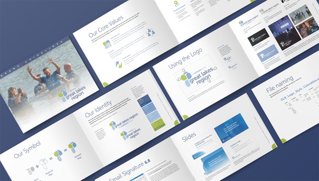
Maxim Design Group created a visual identity and brand guidelines to help guard the brand strategy and culture. The logo represents the districts in an abstract way — individual states, but part of a whole, fitting together almost like a puzzle. It’s abstract, but once a person has the “aha” moment realizing it’s a map of the region, they can’t unsee it and feel a connection because they get it.
“Working with Sharie and the Maxim Design Group was a delight. It was obvious that they wanted what was best for our organization and were thorough in helping us not only rebrand, but in setting a course for long-term branding effectiveness. I highly recommend them.”
Chris Conrad
Region Superintendent
