Identity Concepts for

Empowering Futures, LLC

Visual Identity

Creative Brief

Project Objective

Create a visual identity that aligns with the brand strategy, conveys professionalism and engenders trust. We need to convey credibility for those instant judgments people make so that the organization can engage them long enough to prove its trustworthiness.

Logo Requirements

The logo must coordinate with affiliate brand logos, LifeMethod and Q5 Experience. 

Could Include

Symbols of growth and thriving like leaves, a tree or seedling. Could use symbols that convey neuroscience (brain, brain waves, neurons). Could use something similar to the brand’s forerunner, Business Coaching Group, with arrows or stars.

ROOTS – Foundational Beliefs
  • Transformative change is built into our neural structure: neuroplasticity.
  • We are creative agents doing transformative work in individuals, businesses, and communities.
  • Everyone is whole and complete, equipped with everything they need to thrive.
  • We live a life of freedom when we operate “from” our value instead of “to” it.
  • Life is empty and meaningless — a blank canvas to create from.
TRUNK – Core Identity
  • MISSION: Our mission is to empower people to live a life of freedom by breaking through blind spots holding them back.
  • CORE VALUES: Stay Curious: Explore possibility, create opportunity, and start with a blank canvas. Be a Learner: Listen well, listen first then respond, and assume positive intent. Enjoy the Journey: Assume abundance, gather together, and have fun. Prioritize Workability: Show integrity, find common ground, collaborate vs. compete, and serve others.
  • UNIQUENESS: We empower lasting transformation through Core Value-Based Coaching—knowing your true value. We offer transformation for individuals and businesses

  • AUDIENCES:

    Debbie is a strong-willed, high-achieving woman in her late 50s. She struggles with post-retirement identity and purpose and worries about financial stability after retirement. She needs help to discover her purpose, manage her finances wisely, and maintain a fulfilling relationship with her spouse.

    Steven and his wife built a successful business together, but now face transitioning out of their business. They need a clear strategy to sell the business and create a sense of purpose and togetherness post-business.

    Anonymous business partners for 10 years with diverging visions for the future. They need improved communication, conflict resolution, and a clear roadmap for business and personal development to rekindle enthusiasm for their shared venture.

  • PERSONALITY: asdf

BRANCHES & LEAVES – Channels of Your Work & Touchpoints
  • Content Marketing: Website/Blog, YouTube, Facebook, LinkedIn, Emails, PR (podcasts, speaking engagements)
  • Coaching: Individual Coaching, Team/Business Coaching, Retreats/Events
  • Training Coaches: Mentoring, apprenticeships, certification
  • Operations: Accounting, tech support, registration, customer service, collecting stories/testimonies.
FRUIT – Results
  • Next 3 Months: TBD
  • Next 12 Months: TBD
  • Next 3 Years: TBD

One Page

Brand Strategy

1 - Roots

Foundational Beliefs – These provide motivation for our mission by answering our big “Why?”

1 of 5
2 - Trunk

Core Identity – The inner heartwood of the trunk is the core of a brand strategy: Mission, Core Values, and Personality. The bark represents the elements that require looking outward: Audience, Uniqueness, and Messaging.

2 of 5
3 - Branches

Key Channels of Your Efforts – each program area, product category, administration, marketing, etc.

3 of 5
4 - Leaves

Touchpoints – the leaves represent all the ways people interact with your organization: each way a person might bump up against your organization. These experiences form your brand — the thoughts and feelings people associate with your organization.

4 of 5
5 - Fruit

Results – Healthy growth is a good indication that the roots, trunk and branches are authentic and aligned: the roots (beliefs) feed the trunk (core identity or guiding principles) which fuel the branches (channels of your efforts) and produce results.

5 of 5

How to Choose a Logo

Remember the Objective

Consider the Competitive Landscape

Evaluate from Your Audience’s Point of View

Consider the Traits of a Good Logo

Sleep On It

What Makes a Good Logo?

It’s Memorable

A “sticky” logo is unique and simple

It’s Appropriate

It fits expectations for the type of organization

It’s Versatile

It works across a wide range of sizes and media

Color Palette

Navy blue communicates strength, authority, stability, and security.

Green communicates growth, thriving, health, and energy.

Light green communicates nature, spring, and rebirth.

Teal communicates creativity, harmony, tranquility and balance.

Gray is a comforting neutral.

Concept 1

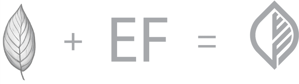
The first concept combines a contemporary, abstract image of a leaf (growth, thriving), and the brand’s initials, E. F., forming the leaf’s veins. The veins point upward from left to right conveying positivity, growth, and momentum.

Concept 2

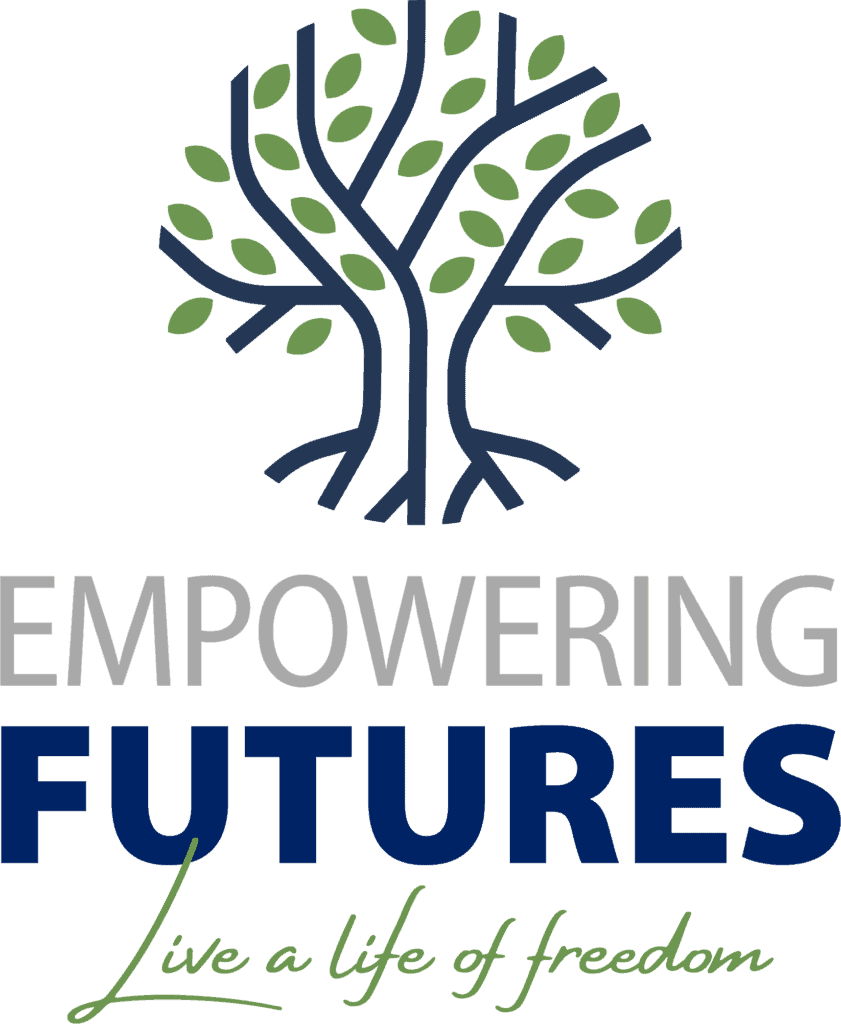
The second concept spotlights a tree symboling growth, thriving, and legacy. It also gives a nod to the idea of seasons, which fits well with your key audiences who, in one way or another, are facing new seasons of life. Additionally, we’ve talked in our discussions about how a tree might provide a good framework for explaining how the primary concepts you teach work together.

Concept 3

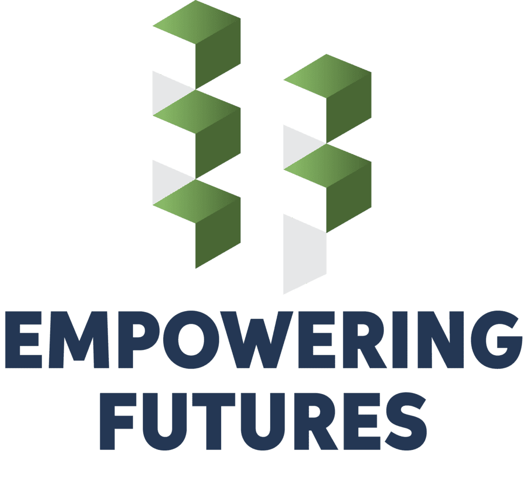
The third concept is the most abstract. It uses isometric design to highlight the sides of 3D-looking letters, the brand’s initials which can be see in the negative space. Looking at the design another way, you might see arrows — or birds — pointing up and to the right, suggesting movement and growth.