A Common Story for Small Business
Ours is a classic tale of the cobbler’s children who have no shoes.
Maxim Design Group was born in August 2001 with a handful of clients from freelancing. Long-term client relationships are the norm around here and always have been. Most new clients come through word of mouth or as leaders we work with move on to new ventures and positions in other organizations. A few have come to us through connections made as an exhibitor at NRB (also a client). Marketing for ourselves was a low priority because we had enough work and clients’ work came first.
Our core identity is a living document. By that, I mean that we embrace and embody it. We live it. But I also mean that we wrestle with it and modify it when we discover a better way to express the components of our identity.
A couple of years ago, we started refining how we talk about who we are and how we help organizations. We began to recognize that design and marketing can’t compensate for organizational misalignment. The real need was upstream: alignment across identity, messaging, decisions, and daily practice. As our work evolved, we saw new opportunities to help organizations build momentum through alignment, not just communication.
This shift didn’t change what we value. It clarified where we do our best work: helping organizations align before they amplify.
True to our own framework, we clarified who we were becoming before touching visual identity or marketing. Our guiding principles remained the same, but our refined focus on alignment required new offerings that come before communication and design—and a model for ongoing alignment support.
While our core identity has been strong, ironically, our visual identity and website became became increasingly out of step with the direction of our work over the years as we neglected it.
Luckily, we had solid relationships with our clients, so our client relationships remained strong because the experience of working with us was aligned, even when our external expression wasn’t. But as we looked ahead, expanding our audience required our outward expression to match what had long been true at the core.
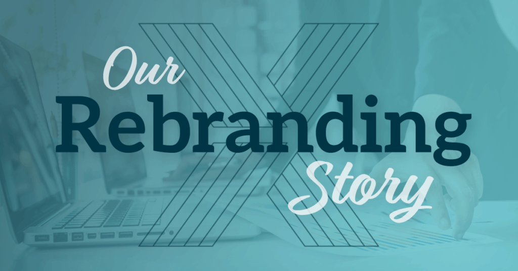
The Evolution of Our Visual Identity: Aligning what people see with what’s true at the core
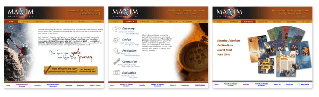
Though Maxim is a woman-owned business, the name, original logo, and visual style were intentionally masculine to reflect our overwhelmingly male audience.
Our first logo had the feel of a movie studio logo at the start of a feature film (complete with all the embossing, shadows and glows that were common in that era — so late 90s/early 2000s!). We used a metaphor of mountain climbing in our early days to describe our process. The only part of our visual brand that reflected me personally was the X in the logo that combined a serif letterform with a dry brush stroke of paint, a nod to my current creative expressions in graphic design and roots in fine art.
In 2008 prior to an event where we were investing in printed materials, we tweaked the logo, changing the sharp apex of the “M”s that looked like mountain peaks to rounded lowercase “hills” that looked a bit more friendly and fit our personality better. We dropped the dark background and stripped away the Photoshop effects. It was passable, but not the full visual identity revamp that Maxim Design Group needed. It looked static which didn’t convey our bias toward action and optimistic look toward the future.
Then, in the summer of 2018, as I was exploring possibilities in my notebook, an idea hit me. Four planes, like pieces of paper, could be arranged in a way that created an X and an arrow in the negative space where they intersect.
It reflects what our work had already become: forward-looking, alignment-focused, and oriented toward momentum. The four planes point to the core of our work: helping organizations align identity, decisions, messaging, and daily actions so momentum becomes easier to sustain.
The new logo in action
The new color palette of teal, salmon, and green, is optimistic without being too bright or saturated. It’s a bit unusual, so it stands out from other sites.
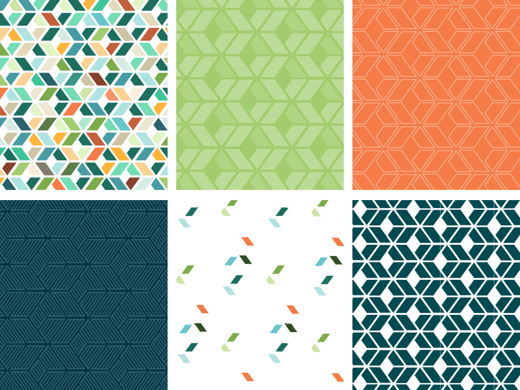
As we explored supplemental graphics for our identity system, we discovered that the X symbol creates some visually interesting patterns.
We designed the site with three visual objectives (beyond the content strategy).
We wanted the site to showcase alignment in action across the organizations we serve, but knew that if we used a lot of photography and textures in addition to the portfolio pieces, it would fight for attention. We kept the background restrained so the work—and the ideas behind it—could carry the weight. That propelled typography to a leading role in the design.- We wanted the site to stand out from standard WordPress templates with predictable blocks of content.
- We wanted some interactivity for engagement without it being a distraction. Like all good communication design, the better it is, the less you notice it, and the more the message comes through.
Is it time for you to rebrand?
We rebranded because we saw a consistent gap in what clients needed: alignment before marketing. When identity, messaging, decisions, and daily practice align, organizations move with greater clarity and momentum—and marketing begins to work the way it should.
Only after clarifying our core did we address our visual identity and website. Both were outdated. Embarrassingly so. Every time I ran across a printed piece with our logo or had to put it on a proposal I would cringe.
If your organization is at a similar point—clear on direction but ready for stronger alignment—we can help you evaluate what’s already true at the core and where alignment needs to deepen. From there, we develop messaging, design, and systems that reflect that clarity and help it take hold.